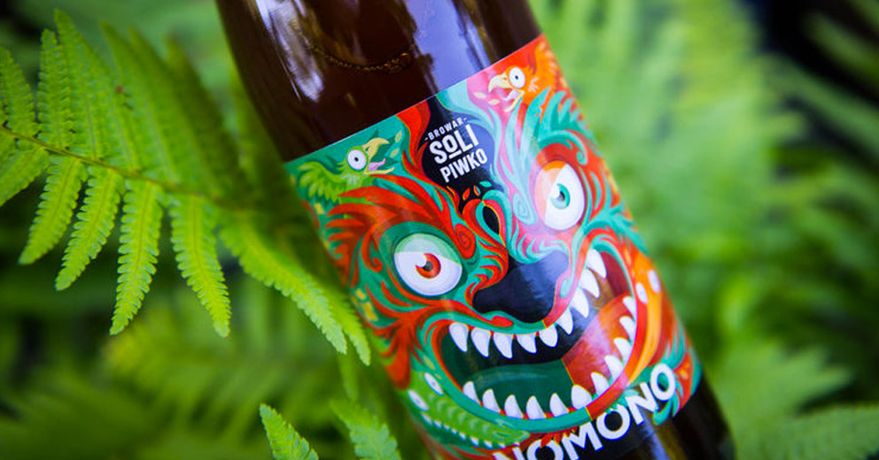
I’m obsessed with beer and liquor packaging. I still draw tons of inspiration from book covers but the past ten years or so the label design of beer, wine and alcohol has become more creative and adventurous as microbreweries, microdistillieries, and local vineyards compete for distinction.
A good label is efficient: it combines strong typography, illustration, and clear focus to communicate what the product is, to whom it’s speaking and what separates it from the competition. Not an easy task when a consumer is scanning a shelf of beer at the store. And that’s the thing: people don’t read, they scan. This is especially true in packaging but it applies across all media in varying degrees. Why am I using bold text to emphasize points in these blog posts? My hope is that it helps you scan the page and spend a little more time with the content.
Next time you're at a grocery store, craft beer bar, liquor store, bar or wine shoppe take a minute to review the labels. Soften the focus of your eyes and observe what stands out and why? What are the label designs trying to communicate and to whom? What does the Bud Light design say their audience? Does the packaging of your favorite brew reflect you?
I love book cover design for similar reasons but here’s the difference: a book cover describes the contents but a beer label describes both the contents AND consumer. As the craft beer market matures so does the packaging and the identity statements are becoming more nuanced and brave. I'll drink to that.

