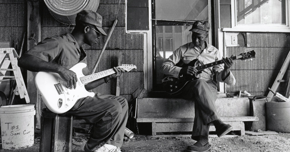
When exploring look and feel there can be only one. Okay, maybe there can be more than one but the point is this: Less is more. It’s more selective, it’s more empowering and it’s more efficient. Using fewer references forces you to select the most valuable starting point.
Try this next time you're exploring aesthetics for a design: collect a bunch reference material as you might normally then select the top three, maybe four. One of these is your primary visual reference and the other two or three might have elements you'd like to incorporate. Then begin designing using the primary reference as a base.
This doesn’t mean you should copy directly or be a clone. Just have a simple statement of your aesthetic goals and trust that the process of creation will result in something unique. Your project likely has different content, goals, etc. It will become something different in your hands.
For years everyone one of my projects had folders of reference material for character design, UI, typography, environments, etc. I wasted a lot of time trying to synthesize all those diverse elements. Now I force myself to be selective and choose the fewest reference points I need to get started. While working I allow myself to follow tangents so each piece can find its own identity.


